Ochre, Scribbles, & Marks That Stayed
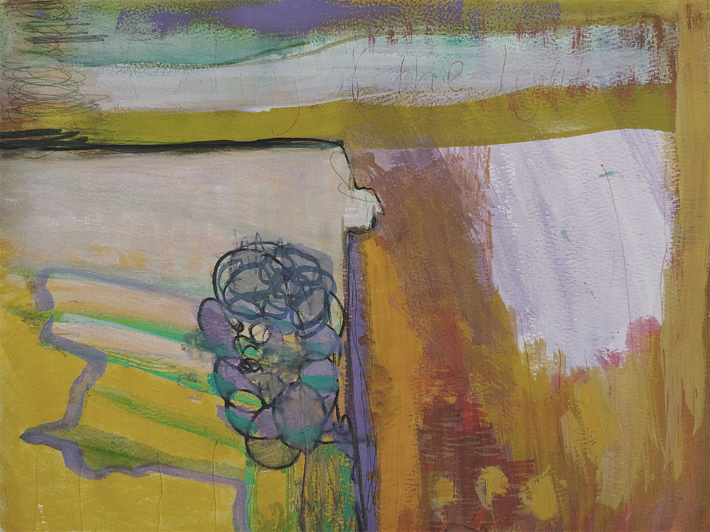
A split down the centre. That’s the plainest way I can describe it. The left half is loud — mustard yellow, dark looping marks, a hard edge cutting across. The right half pulls back. Washed out, softer, more air than paint. And a wide band of olive-gold running across the upper third ties the two sides together like a seam that won’t quite hold.
I wasn’t thinking about landscape. But there it is — horizon lines, a strip of sky at the top where teal meets bruised lilac. The thing is, none of that was planned.
The First Mark
How and Where I Started
Yellow. A flat brush, maybe two inches wide, loaded heavy with a mustardy ochre and dragged fast across the lower half. No pencil sketch, no plan on the paper first. Just pigment and surface.
The paper grabbed it unevenly — heavyweight stock does that, pulls more in the valleys of the tooth, lets the ridges stay almost dry. That irregular absorption became structural, honestly. I kept going back to the yellow even when the painting didn’t need more of it, because the colour felt right in my hand that morning. The studio was cold, I remember that. February light, kind of grey-blue through the window, and I was working against it with all this warmth.
Half-rational, half-stubborn.
Layering & Texture
Building Up and Scratching Back
There are probably six or seven layers in the densest spots. Olive over yellow, lavender over olive, then white dragged across with a wide palette knife — not to cover but to let what was underneath ghost through. The white in the upper portion is thin enough that you can see teal and pale pink beneath it, like looking through a fogged window.
The scribbled circles on the left came from a graphite stick pressed hard into still-tacky acrylic. The tooth of the paper caught the graphite differently where paint had settled into the valleys versus where it sat on the ridges. A gritty, chalk-dry drag. And then I went over parts of those loops with a diluted purple, so they sit in this weird space between drawing and painting. Not quite either.
The scratched text across the upper band — barely legible, more felt than read — was done with the pointed end of a brush handle while the paint was still soft. I kept it faint on purpose. It’s there if you look. It doesn’t shout.
Edges & Boundaries
Where Forms Meet, Bleed, or Stop
The sharpest edge in the whole piece is that dark line — almost black — running horizontally just above centre-left, where the olive band drops to meet the lighter field below. A hard stop. I nearly softened it, but everything else was so blurred and gradual that it needed one definitive cut. One place where a form just ends.
But then look right. The ochre-gold slides into warm brown that bleeds into pink that bleeds into lavender, and there’s no boundary at all. The forms dissolve. It’s the contrast between those two approaches — hard left edge, melting right — that keeps the composition from going slack. I didn’t decide that consciously, I noticed it after the fact and left it alone.
Context
How This Fits Into the Paper Series
Abstraction belongs to the Paper series, where I’ve been working at this scale — 11.81 × 9.06 inches — for a stretch now. The smaller format changes everything about how I move. On canvas I’m standing, using my shoulder, reaching. On paper I’m seated, working from the wrist and elbow, and the marks are more intimate for it. More like handwriting than house painting.
This piece pushed the contemporary abstract painting process further into mixed territory — graphite, scratched text, thinned stains alongside opaque strokes. Acrylic layering technique on paper rewards a different kind of patience than canvas does. The surface has just enough drag to catch dry media but enough smoothness to let washes flow. And because it’s paper, there’s an immediacy: no stretching, no priming, just open a sheet and go.
That directness shows in Adrienne’s work.
You can see the full piece and purchase details here, and more about my practice on the about page.