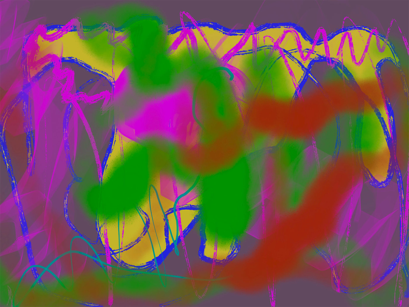
Too Loud, Exactly Right
What even is this piece? Honestly, it started as a dare I made to myself — fill a canvas with every colour that shouldn’t work together, then figure it out. Crazy Purple isn’t about purple in any precious way. The purple is the ground, the thing everything else fights against. Magenta, green, blue, rust, teal. All thrown down fast, all competing for the same space, and that contest became the painting itself. A loud, almost-reckless abstract digital painting that I kept pushing past the point where most people would stop.
Edges & Boundaries
The blue lines are where everything happens. Not neat outlines — more like scribbled fences that loop, scallop, and drip across the upper half. Cobalt. Dense. With a dry-brush texture I faked using a gritty charcoal brush at about 40% opacity. They don’t contain anything; the green and magenta bleed right through them. And that was the point. I wanted edges that announced themselves without actually doing their job.
In the lower-left corner, a thin teal line slides in — smooth, almost calligraphic, totally different from everything above it. It sits there like someone whispering in a loud room.
Layering & Texture
The build-up here is more tangled than it looks. I laid the muted violet ground first, then blocked in a warm ochre-gold shape across the centre, the kind of half-formed rectangle that gave me something to push against. The green went down next — soft airbrush passes, no hard edges, pooling in the middle like fog rolling in. Then magenta, semi-transparent, layered over the violet at the left and right margins so the two colours bled into a kind of bruised pink.
The blue line work came last. Or almost last.
I kept switching between a textured round brush and a flat rake brush to get that scratchy, chalk-dry quality where the blue breaks apart over the green underneath. The rust-red shape on the right was a late addition — I dropped it in at maybe 85% opacity, and it immediately made the green next to it look cooler and wetter than it actually was. Digital painting layering technique at its most trial-and-error: stacking, toggling visibility, swearing at my tablet, stacking more.
What Got Removed
There used to be a yellow zigzag running diagonally from upper left to lower right. Loud. Too-obvious-for-its-own-good loud. I lived with it for two days before I painted it out with the violet ground colour, and the relief was instant — the composition could finally breathe across the centre. But traces stayed. You can see a faint golden edge peeking through behind the green in the mid-left area if you look closely. That ghost gives the surface depth it wouldn’t have otherwise. And I almost brought back a thick white scrawl along the bottom, but the teal line did the same work with a quarter of the noise.
The Pause
This one sat on my second monitor for nearly a week. Unfinished, too-hot, staring at me every time I checked email. I’d glance at it sideways, think “it needs something cold,” then go make coffee instead. The teal loops at the bottom only appeared after that week-long stall. Sometimes a piece just needs to bore you before you figure out what it’s missing — which, honestly, was restraint in exactly one spot.
Context
Crazy Purple belongs to my Digital series, where I work without undo anxiety and lean into the mess-making speed that a stylus on a screen allows. Compared to the quieter entries in the series, this one cranks the saturation dial past polite. It sits alongside pieces that explore contemporary abstract painting process through colour collision rather than colour harmony — the branch of the series where I’m not trying to be tasteful. You can view the full piece on its product page or read more about how the Digital series developed on my about page