Bold Gestures and Layered Colour on Paper
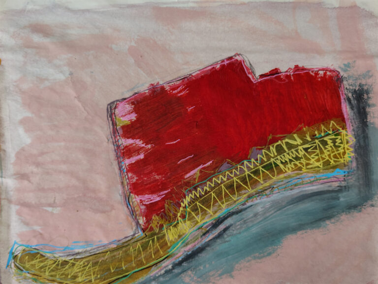
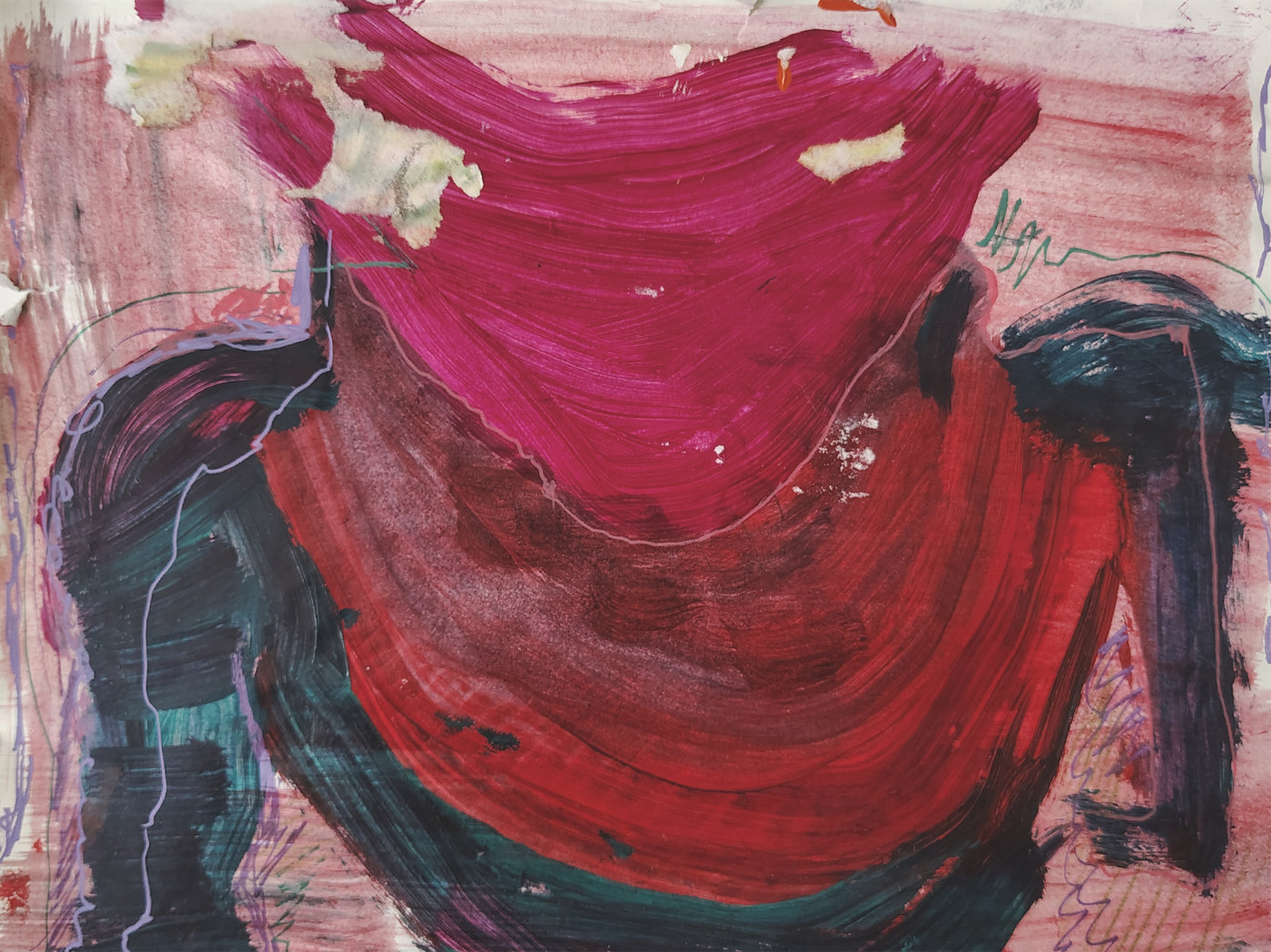
Bust is about containment and release. The central form curves inward like something holding itself together, while the marks around it push outward, restless and energetic. I didn’t set out to paint a figure, but the title stuck because the shape reminded me of a torso — not literal, just the feeling of one. What drew me in was the tension between the soft magenta wash at the top and the heavier, darker strokes anchoring the bottom. It’s a painting about weight and lift, about what we carry and what we let go.
Layering & Texture
I worked this piece in passes, letting each layer dry before deciding what came next. The magenta area at the top went down first — broad, wet strokes that soaked into the paper slightly. Once that settled, I added the deep red underneath, working it into the curve. The dark teal and black marks came last, applied thickly with a loaded brush. You can see where I dragged a palette knife through wet paint, exposing bits of the layers below. This acrylic layering technique gives the surface depth without feeling overworked. The paper holds the paint differently than canvas — it absorbs quickly, so you have to commit to your marks.
Context
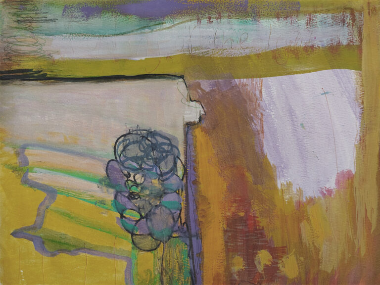
Bust belongs to my Paper series, where I explore what heavyweight paper can handle as a painting surface. These pieces tend to feel more immediate than my canvas work — there’s less prep, less priming, just me and the sheet. I’ve been drawn to paper lately because it forces quicker decisions. You can’t sand it down or gesso over mistakes the same way. This mixed media abstract on paper approach has opened up a looser, more responsive way of working for me. If you’re curious about the rest of the series, I’ve gathered them together in the Paper Collection. You can also read more about my background and approach on my about page.
Colour as Problem-Solving
The reds in this piece gave me the most trouble. I wanted warmth without tipping into something too aggressive. I mixed my own red from cadmium and a touch of burnt umber, then tested it on scrap paper before committing. The magenta was straight from the tube Rose — because I needed that punch of cool red to balance the warmth below. The dark teal came last, almost as an afterthought, but it ended up doing the heavy lifting. It grounds the composition and keeps the brighter colours from floating away. This is what I mean by contemporary abstract painting process — colour isn’t symbolic, it’s functional. You choose it because it solves a problem in the moment.
Edges & Boundaries
Look closely at where the magenta meets the red — there’s no hard line, just a gradual shift where one colour bleeds into the other. I used water to soften those edges while the paint was still wet. But then, near the dark teal strokes, I let the edges stay sharp and uneven. Some areas show pencil marks underneath, faint green scribbles I made before I even picked up a brush. Those marks stayed because they felt honest. The boundaries in this painting aren’t uniform — some forms dissolve, others dig in. That variation keeps your eye moving. It’s the difference between a painting that sits still and one that breathes.